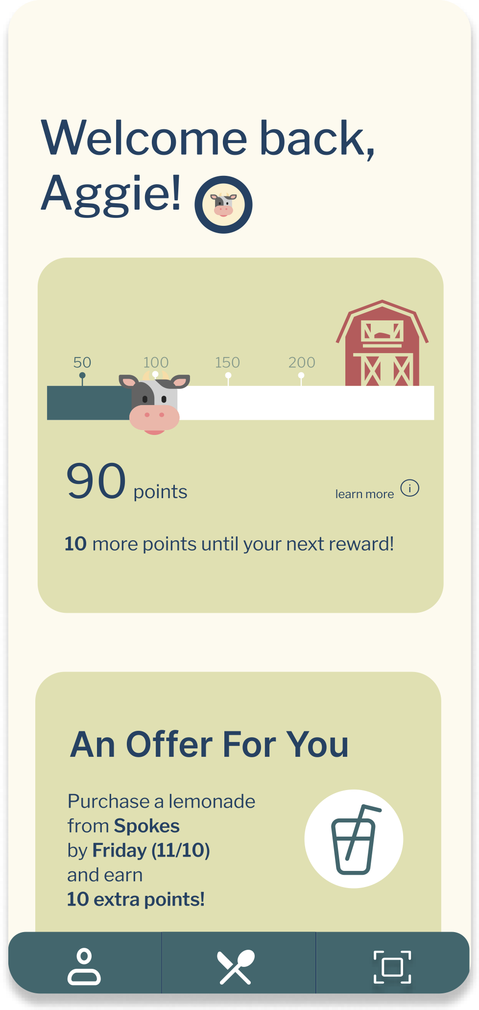
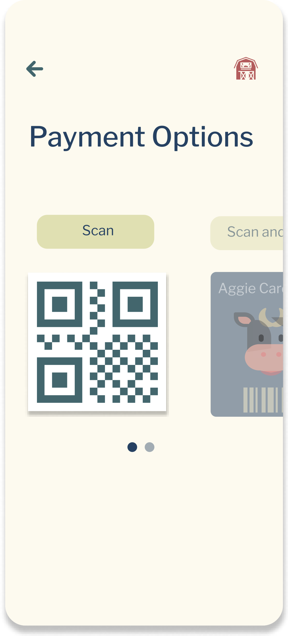
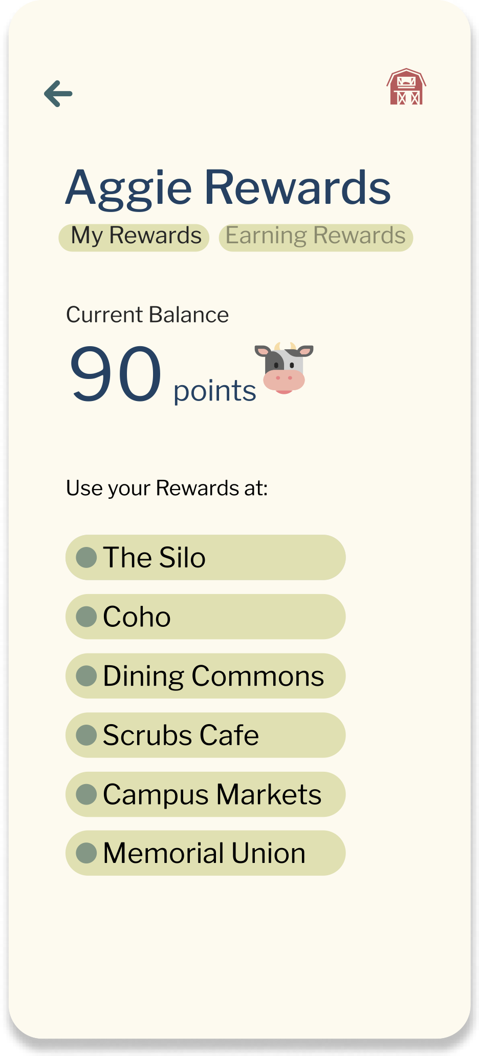
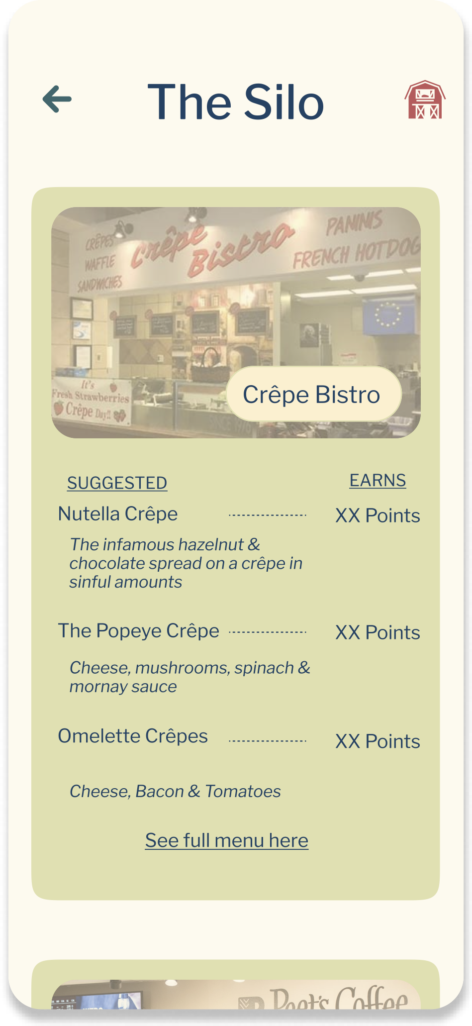
Aggie Rewards
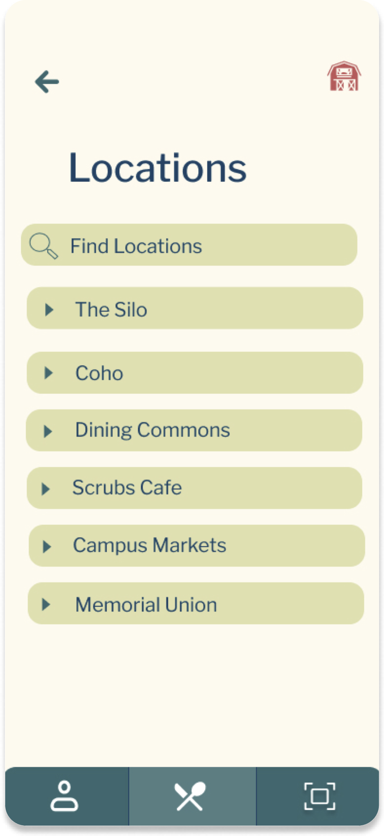
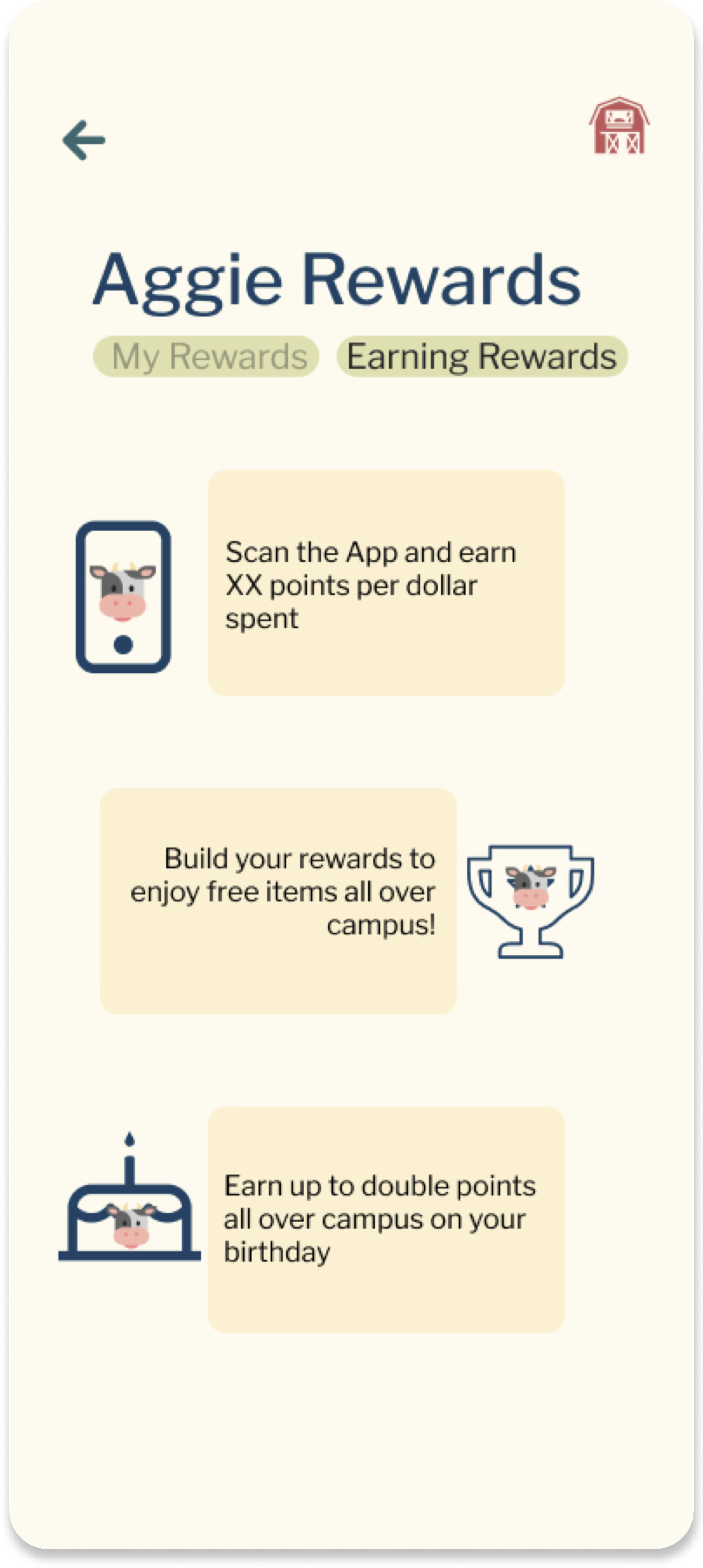
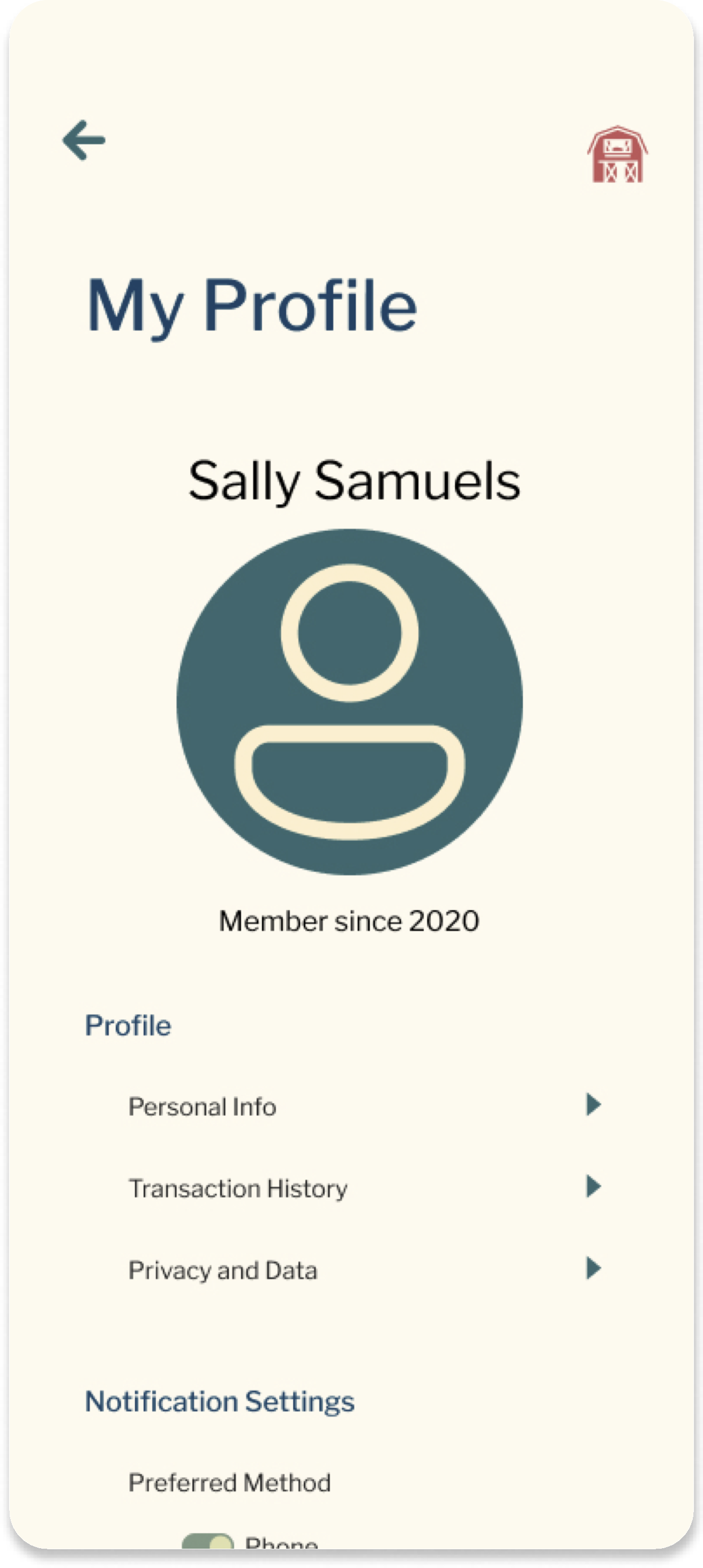
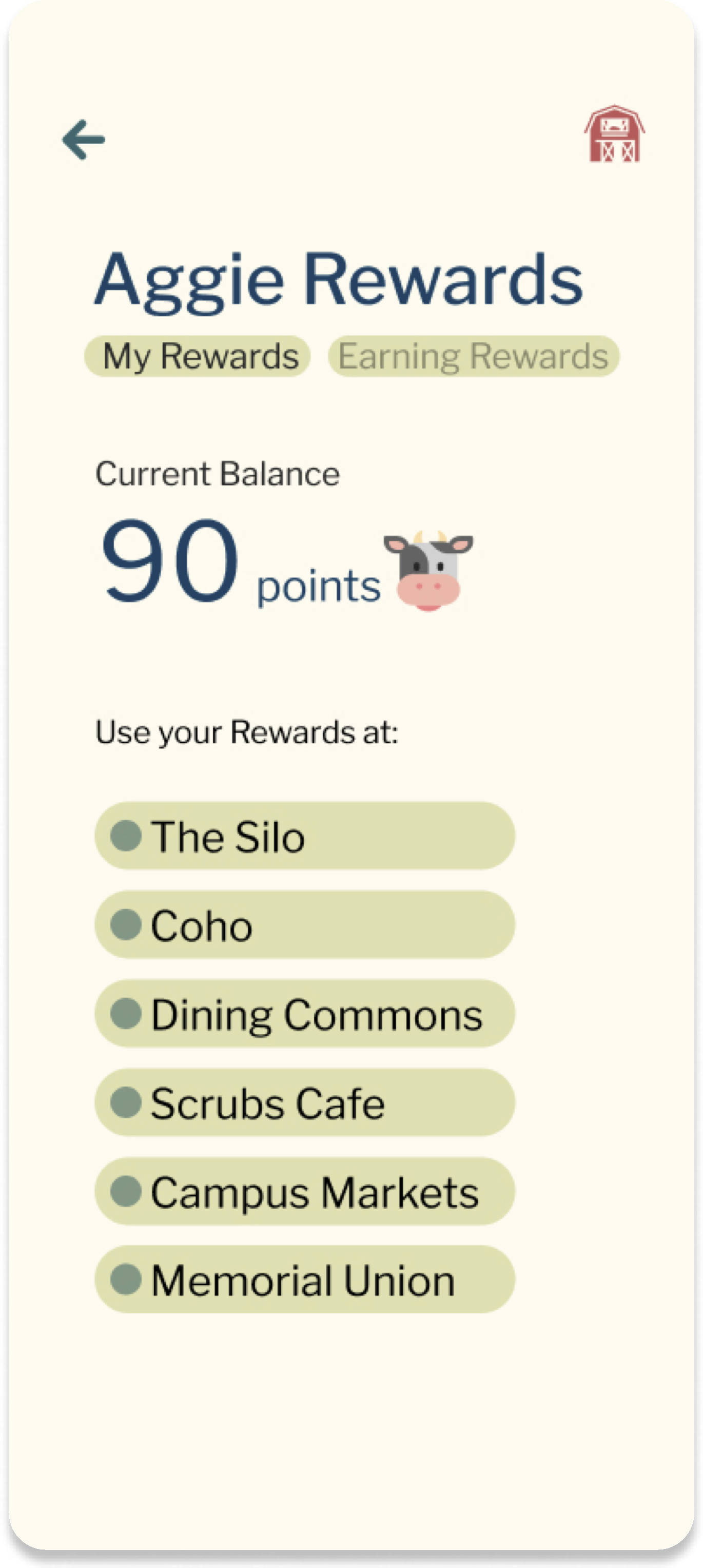
A rewards app created for UC Davis students to promote higher spending and visits from students at on campus dining areas.
Timeline
October - November 2023
My Role
UI/UX Designer
Tools Used
Figma
The Problem
UC Davis lacks a rewards program and other incentives to promote students to visit on campus dining areas often.
Target Audience
Narrowing down the audience to students on campus was the best decision to understand the audience using the rewards app.
USER RESEARCH
Research Results
SURVEY RESULTS
22.7% said they never use rewards programs because of annoying interfaces, confusing rewards systems, and other issues concerning usability and convenience
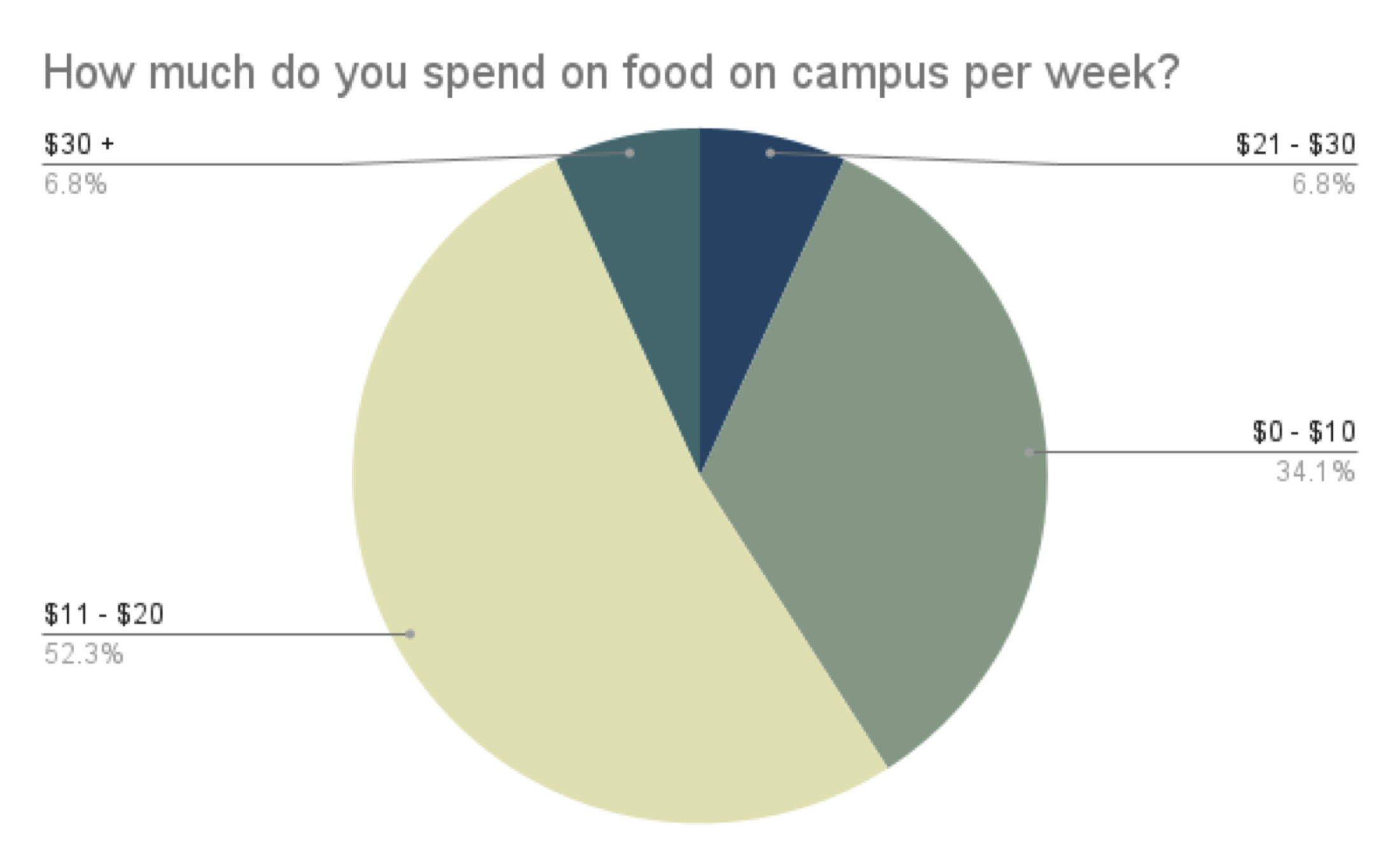
A majority of the survey respondents got their current knowledge about finances from their parents/family members or did their own research.
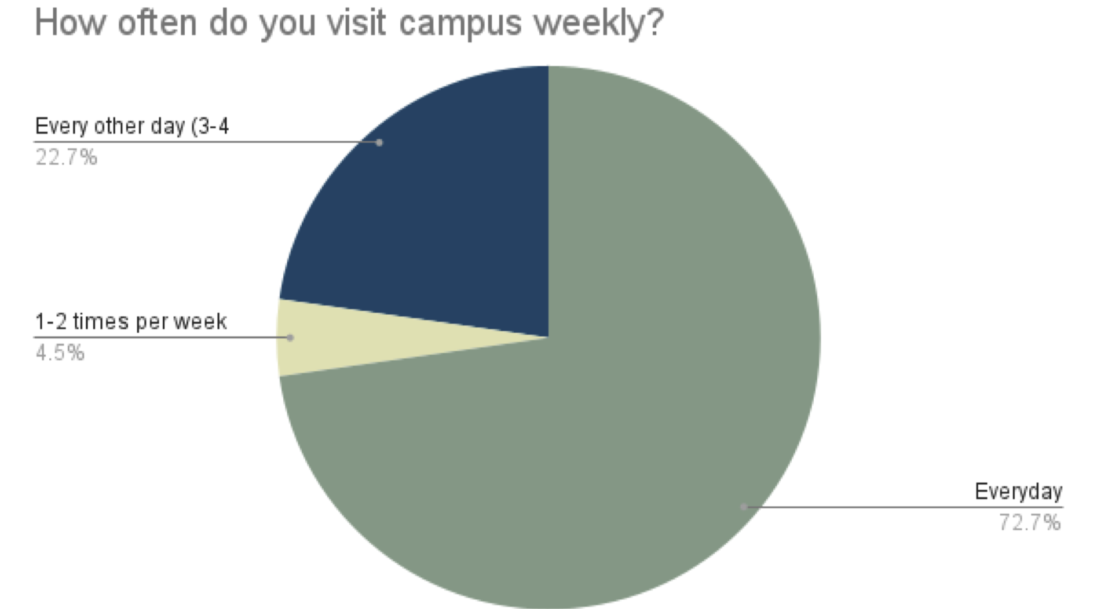

“A points system based on purchases made that gives free food/benefits is the best rewards program”

““In general I don't use them because the rewards are usually so little and I always forget to use the apps for them when I do end up purchasing something.”

“I think rewards programs have to include only necessary messaging. If it's mixed in with a lot of other promotional emails or texts, I tend to ignore it."
COMPETITIVE ANALYSIS
To better understand existing apps that provide rewards for food purchases, we focused on
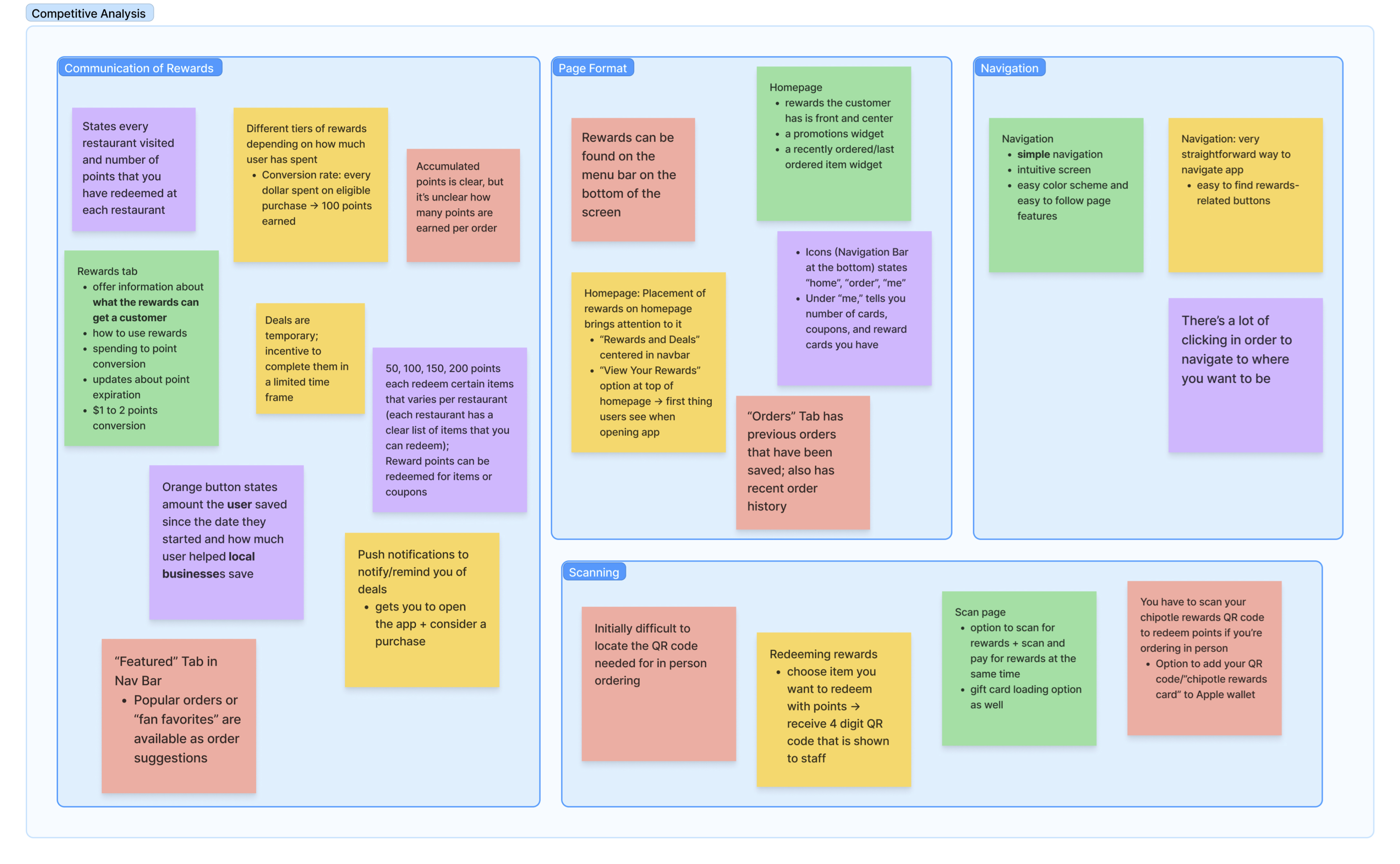
- Starbucks
- Panda Express
- Muncho
- McDonalds
In this process, we focused on
- Understanding common features and design patterns in successful existing rewards systems
- Distinguish features that we wanted to incorporate into our app
Problem Statement
How might we develop a rewards app that not only
but also promote their engagement with the rewards app?
PROTOTYPING
Lo-Fi Sketches
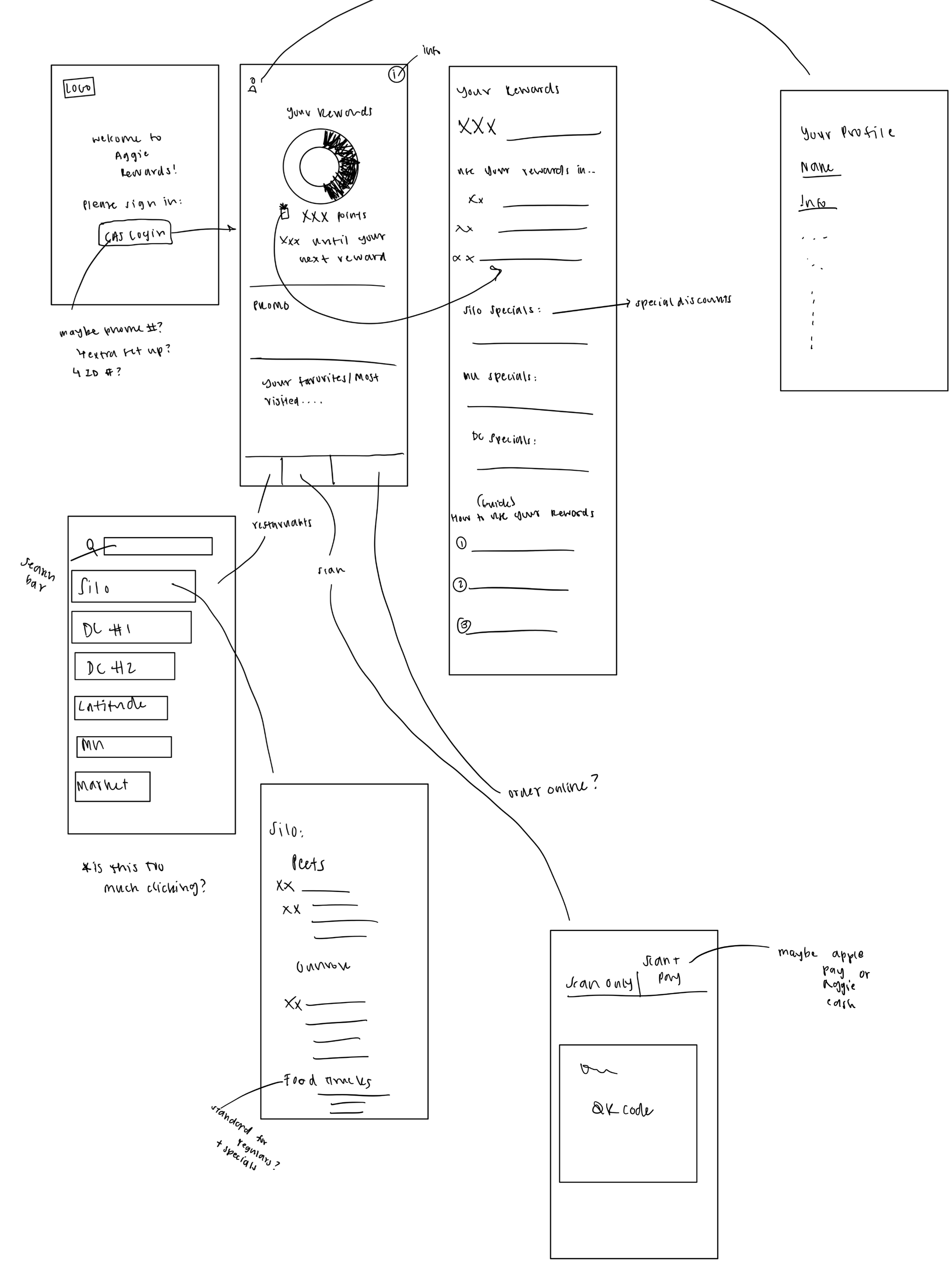
The initial sketch focused on:
- Takeaways from the competitive analysis
- Developing useful and enjoyable app
Some issues we faced in this stage:
- Making it an “easy-click” experience
- Developed ideas that required confirmation after survey analysis + further research were finalized
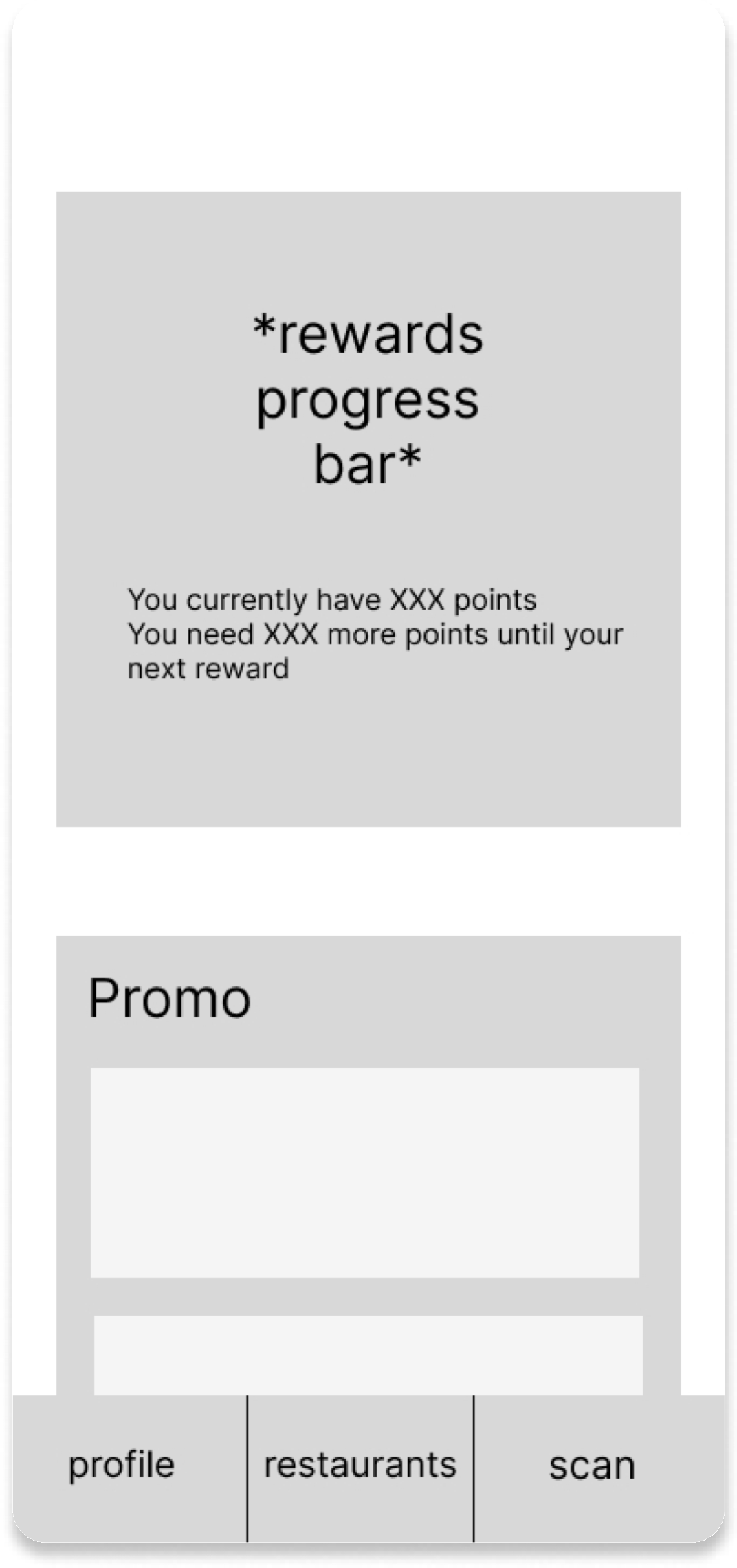
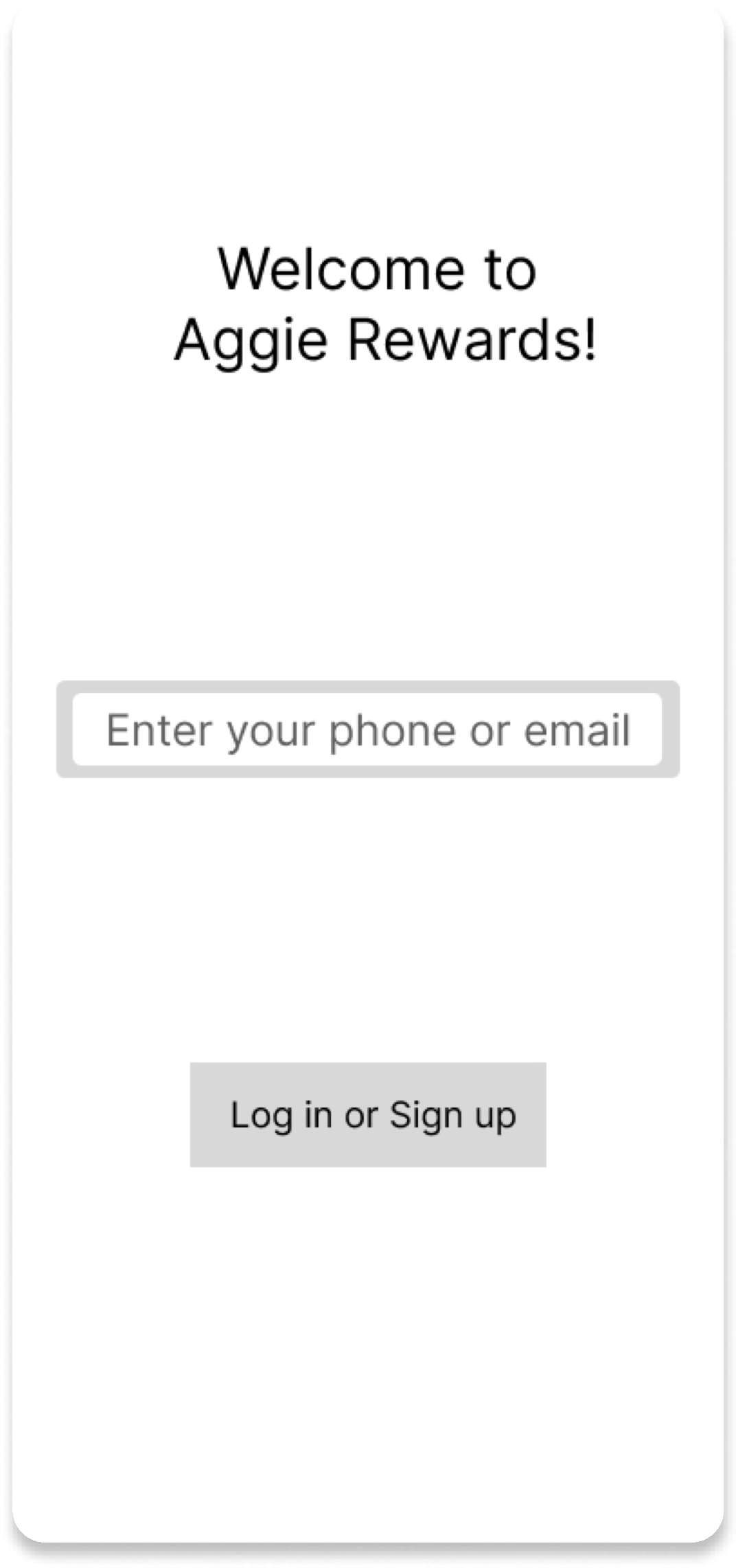
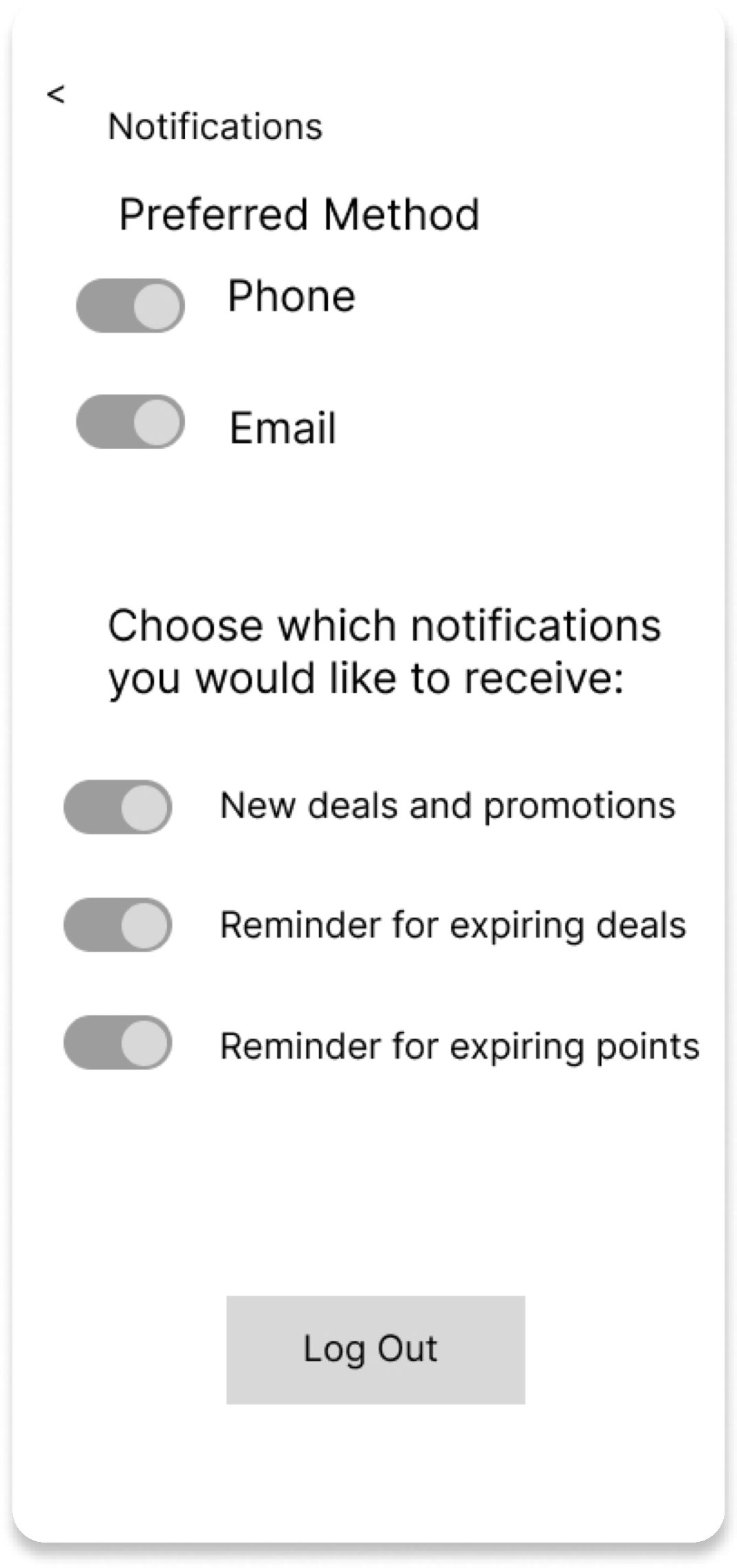
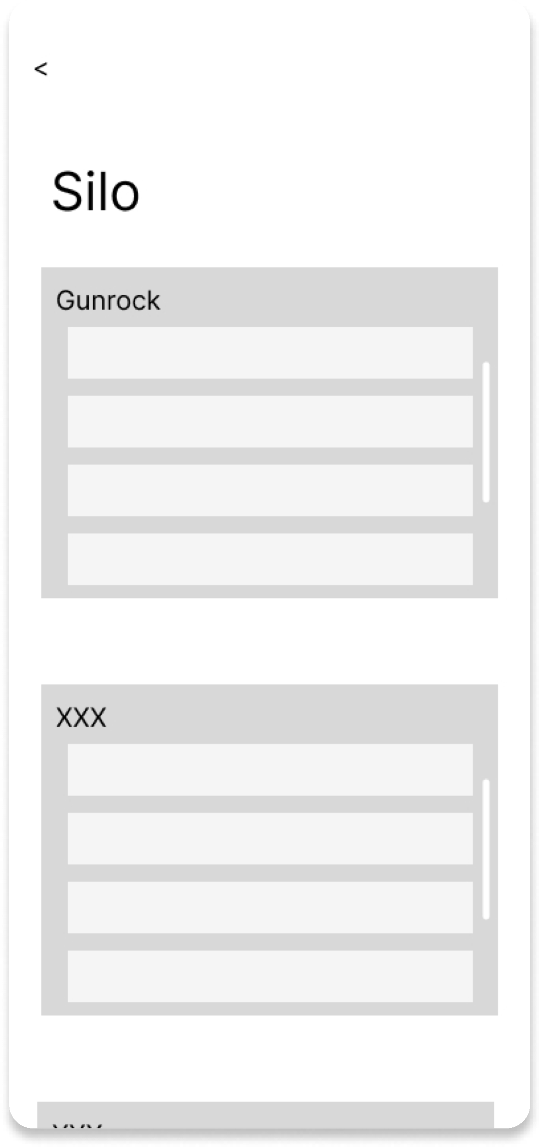
Mid-Fi Sketches
DESIGN SYSTEMS
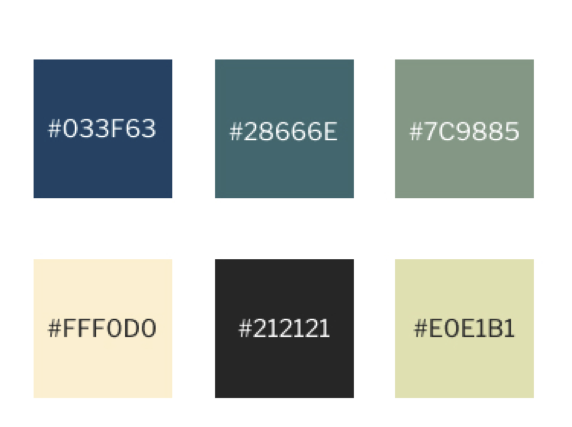
Color Schemes
Choosing lighter colors and with tones that are easier for users to navigate with are important to ensure that users are more incentivized to use the app
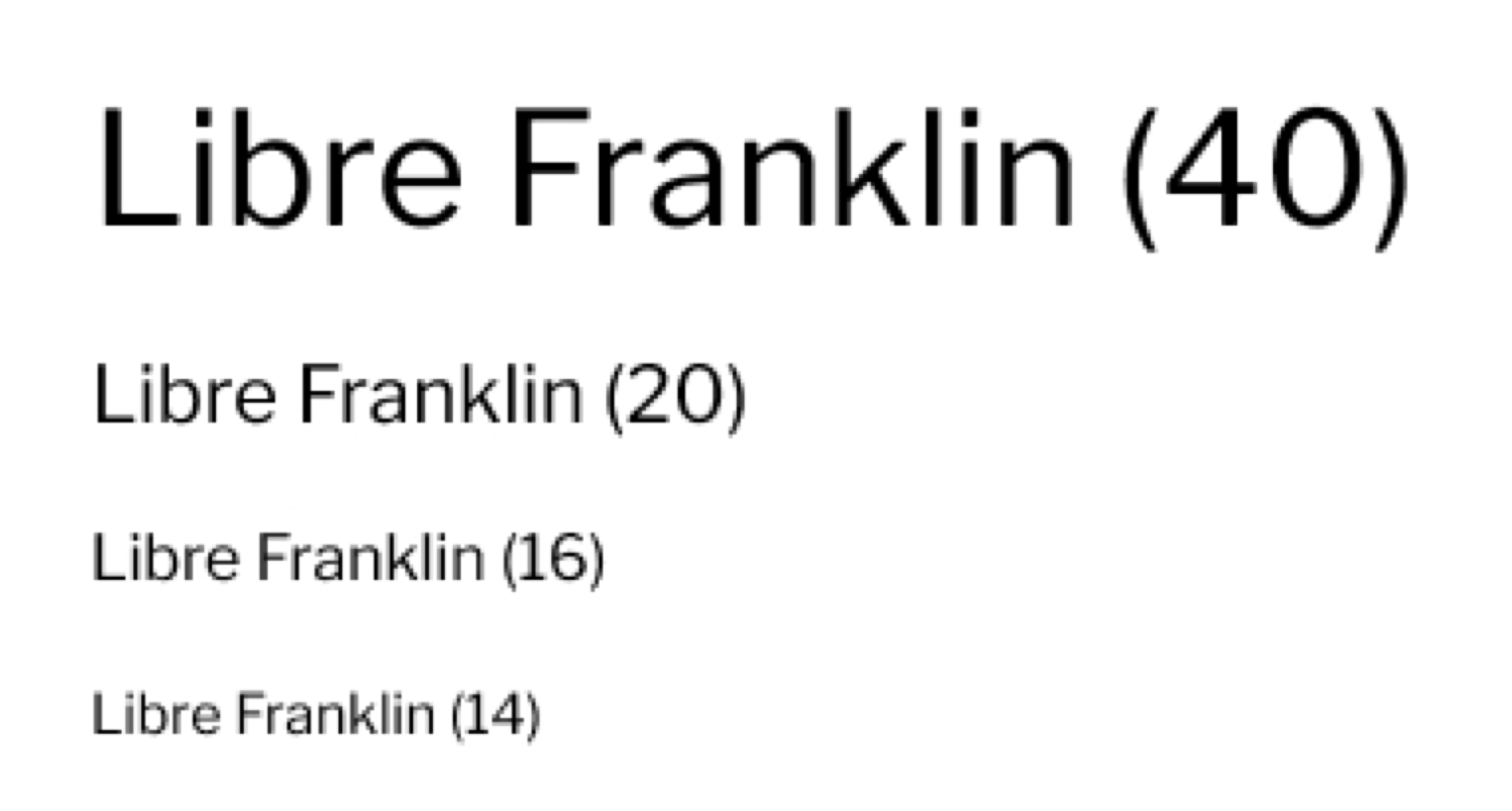
Typography
Selecting a font that was Sans Serif also added to our modern palette and helped pull together the visuals on the app.
Final Prototype
